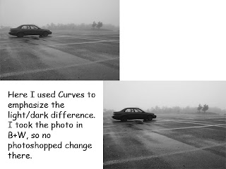
Monday, May 9, 2011
Wednesday, April 27, 2011
Monday, April 18, 2011
Final Project
For my final project, I would like to attempt to illustrate the story of Beauty and the Beast.
This should be a commonly known story, an arrogant prince refuses to give shelter to an old hag who coincidentally turns out to be a witch, the witch curses him and turns him into a Beast, and the only thing that can cure him is for a girl to love him, beast form and everything. He meets Belle, they dance and sing with some silverware for a while, she finds out he's not such a bad guy and they eventually fall in love and the curse is broken in time. Obviously, there's more to it than that, but hey, this is the abridged version.
There are several sequences from this story that could be captured. I.e. the old hag at the door (possibly using a fan and leaves to simulate the harsh weather?), Belle longingly looking out the window, the rose that symbolizes Beast's slowly waning life. Layers could be used to cast a foreboding feel on Beast's body, or a pale, empty layer could show loneliness and forlorn in a picture of Belle.
I think the biggest challenge will be finding costumes and people who can fit the character of Beauty and Beast well, obviously this is essential. In addition, the scenarios may be tough to capture; if I go for a vintage, actual medieval look, it may look VERY cheesy. On the other end of the spectrum, trying to Modernize it (kind of like what "10 Things I Hate About You" did for Shakespeare's "The Taming of the Shrew") may not put across the feeling of Beauty and the Beast well enough.
Ideally, my finished project will have people at least recognizing the story as Beauty and the Beast. The best outcome that I can think of is that after looking at the sequence of photos, they feel a sense of connection and understanding for the plight of both Belle and the Beast; after all, it is a very lasting and relatable story, I think.
Monday, April 11, 2011
Monday, April 4, 2011
Monday, March 21, 2011
"Color" Assignment
Here I used the sharpening tool as they, admittedly, turned out much more blurry than I thought. Also, I brightened the image using the brightness slider.
"Color" Assignment
Color correction, and I used the 'auto tone' feature to brighten these up A LOT. They were originally darker, as they were taken during the mid-afternoon.
"Color" Assignment
These pictures all were horizontal, and thus I did a different type of crop for them. Not much difference between these and their originals, just some higher saturation and color correction adjustments.
"Color" Assignment
Same color, different subjects. I turned up vibrance a good bit for these, since they were taken on a cloudy day and the colors ended up being much duller than I anticipated. For the stop sign, I had to use the Lasso tool to isolate the sign from the clouds.
Monday, March 14, 2011
Monday, February 21, 2011
Sunday, February 13, 2011
Monday, January 31, 2011
Blog Post 1: The House
This is a picture I took of my house in Baltimore, MD. I changed it by adding a gradient that changed the coloring of the rest of the house, but left the cars parked next to it unchanged. I added the caption "Oh look, a house." at the top. Also for laughs I put a purple man standing in the yard.
Monday, January 24, 2011
Subscribe to:
Comments (Atom)


